Headspace Explores a New Audience
“First, how do we design an experience for children that captures the value we provide adult users? Second, is that goal viable?”
The Challenge
Let’s say you have a product that’s really well liked by your core audience. You’ve consistently improved on it and are providing a relevant experience to a growing number of repeat customers. Business is good. So it’s time to expand, to reach out and bring in a new audience. And let’s say your new target is not just different demographically, but fundamentally different in that their brains function differently. What then?
That’s the position Headspace was in when they decided to do a design sprint with Google. Launched in 2010, Headspace is a company that helps people learn to meditate and maintain an ongoing mindfulness practice. The company runs events, publishes books, and curates online content, but their main product is a mobile app service that provides guided meditations and other mindfulness tools. The app has been downloaded over 14M times in more than 190 countries..
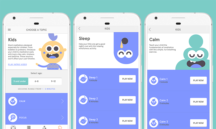
With the main product established, the company was ready for its next challenge. That’s where Headspace for Kids came in. The basic idea of building a meditation application for youngsters and providing content that would inspire kids to sit regularly for mindfulness exercises had been kicking around the company for years. But surmounting the obvious hurdles of getting kids to sit quietly and not think via an app seemed like too much to tackle early in the company’s lifecycle. An initial pilot project had been launched, but shelved. A meditation app for kids was a perfect challenge for a Design Sprint and that’s just what Headspace did with Google’s help in March 2016.

“The basic idea of building a meditation application for youngsters and providing content that would inspire kids to sit regularly for mindfulness exercises had been kicking around the company for years.”
The Team
The Sprint was conducted under the guidance of two Google Sprint Masters Dylin Martin and Mike Denny and attended by a team of UX designers and engineers from Headspace, led by Jeff Hwang, the Senior Product Manager at Headspace and Will Simon the Senior UX designer. In total, there were seven participants in attendance.
Jeff and Will had both read Sprint: How to Solve Big Problems and Test New Ideas in Just Five Days when they were researching ways to improve internal methodologies, but they felt they needed the help of dedicated Sprint Masters to keep the team on point regarding best practices and staying on schedule. Mike was big fan of the Headspace app. Because of the mutual respect, the two teams were excited to work together.
The Sprint
Before the sprint began the Google Sprint Masters met with Jeff and Will to get a sense of the challenge and assign topics for the lightning talks. Will would discuss the research Headspace had already done regarding a child focused app; Jeff was assigned business opportunities; and Dylin and Mike would investigate resources at Google that might have bearing on the challenge. They ended up talking with the YouTube Kids team who had a number of insights about children as an audience. “I think it's really important to look at products/ideas that are different from yours in a lot of ways,” says Dylin, “but if you can find that one thing that's similar, you can learn a ton.”
The Sprint began with a discussion about what needed to be solved over the course of the week. Initially, the question needed to be high level and the team settled on two primary avenues of inquiry: How do we design an experience for children that captures the value we provide adult users? Second, is that goal viable? Simply stating these as parameters was a crucial step in clarifying what success would look like.

“We talked through the ideas, trying to gain a fuller understanding of the subject matter, its inherent constraints, and the ideas our various experts could bring to bear”
With the broad goals clarified, other questions immediately started to arise. Would kids be willing to sit through a guided meditation? How long could they sit? How long would they sit? Is audio the right medium? How do children define a meaningful interaction with software? What about the parents? What would their role be? The team let fly, relying on their broad range of disparate perspectives and personal expertise to uncover the full range of challenges that lay before them. The team looked at software geared towards children like the aforementioned YouTube Kids app, among others, to get a sense of effective UX for their audience. “Basically, we talked through the ideas, trying to gain a fuller understanding of the subject matter, its inherent constraints, and the ideas our various experts could bring to bear,” says Jeff Hwang.
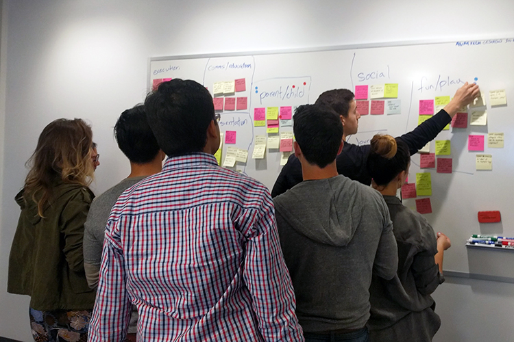
Tuesday and Wednesday were for ideation with the intent of targeting the parameters for the build. The team started concepting with a series of “How Might We’s”, writing open ended questions on sticky notes and affixing them to a wall. “The key,” says Will, “is to not worry about solutions.” The HMWs helped define the potential, the unknown, the broadest sense of possibility.
The next step was to organize the HMWs into overarching themes — to take the idea spaghetti on the wall and straighten it out, clean up the mess, and prioritize which questions required answers.
Dylin points out that while discussing the HMWs and User Journey some critical issues arose that needed more time. “I think a really important aspect of being a Sprint Master is being able to improvise,” Dylin says. “We had a lofty challenge and I had a very set plan, but important ideas came up that required more time. I adjusted the schedule to allow for a few 10 minute discussions so we could create consensus. By the time we got to sketching everyone had a good idea of what they wanted to do.”
Sketching involved what Jeff describes as the act of “diverging, converging, and diverging again.” People would go off and sketch out their ideas, come together to share and discuss, and then go off again and build on the work of others. People started sketching content, user flows, creative ideas, UI ideas, a whole gamut of possibilities. “By the end of Wednesday,” says Jeff, “we boiled it down to the things we could build on Thursday based on what was feasible, what was testable, and what was meaningful.”
Thursday was the build with the goal of producing a functional android app. The team got to work with graphic designers cranking out screens, UX designers building flows, copywriters developing content and recording audio. The whole thing was scrappy and geared not towards for perfection, but testability. Function mattered most. The Google Sprint Masters constantly kept people mindful of the time constraint, helping them prioritize necessity over whimsy. By Thursday end of day, a workable app was up and running.
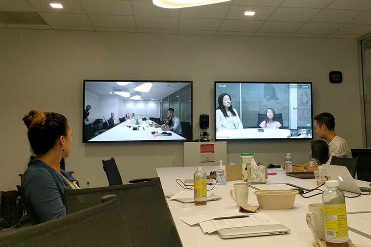
Earlier in the week, work had been done to find a group of test subjects. The team had agreed on three age ranges for the content: children five and under, ages six to eight, and ages nine to twelve. They brought in six children, each with their guardian, and had at least one participant for each target age group. The tests were done by creating a two way mirror with Google Hangouts allowing the sprint participants to watch the testing live without being in the room and influencing the participants’ behavior. A follow-up questionnaire was developed to gather additional information and the testing went off without a hitch. At the end of the day, the whole team convened for a retrospective on the week’s events and the Sprint was complete.

“The whole thing was scrappy and geared not towards perfection but testability. Function mattered most.”
The Discovery
News flash! It’s hard to get kids to meditate. That said, the sprint proved that it is possible to get kids to meditate. Based on the testing, it was clear that the new offering could work. Going into the Sprint, Headspace was working in a space of pure presumption. Coming out of the Sprint, they were working with proof not only that their big idea was viable, but that it could be successful.
There were some very clear learnings that occurred. Children have a difficult time keeping their eyes closed and they struggle to concentrate for more than a minute or two at a time. But within that short time span, they are willing and able to engage in mindfulness exercises. The team also learned how important the parents are to the experience, helping the kids set up the app and answering questions. Parents would be a critical component of the app’s success.
In a broader sense though, the Sprint had an immediate impact on how the Headspace team thought about their own work process. “It turns out constraints are incredibly helpful,” says Will. “And also that you can accomplish a lot in a short time without overworking. Breaks and time to refresh are critical for doing good work and not getting burnt out. We now have more of a marathon mentality to help sustain our efforts.”
The Outcome
The team took their finding back to the home office and almost immediately executed a second Design Sprint, incorporating both the process and the learnings from the first Sprint session. “The team was set up for success, we were able to work more efficiently, go deeper and figure out exactly what it was we were going to ship,” says Jeff.
The team had an MVP by the end the second quarter and completed a successful product launch. The repeat usage on the app is really strong, though the team admits they’re still in early days with lots of fine tuning to come. Perhaps more importantly, the Sprint methodology has become pervasive throughout the company, particularly as it relates to the power and benefit of user testing. “Interacting with real people and getting direct feedback has really been transformative,” says Jeff.
“The team...learned how important parents are to the experience, helping kids set up the app and answering questions. Parents would be a critical component of the app’s success.”